The Workshop
Build a business website from designed sections
The Workshop is the website builder in the Lounge. Every section is drawn in your brand: click one, choose another style, and your words carry across. When the site is ready, publish it or take the code away.
- Sections
- Drawn in your brand, and swapped for another style in place
- Build from a brief
- A site written from your business’s details, by fixed rules
- Export
- Plain HTML and CSS, with a CLAUDE.md for finishing
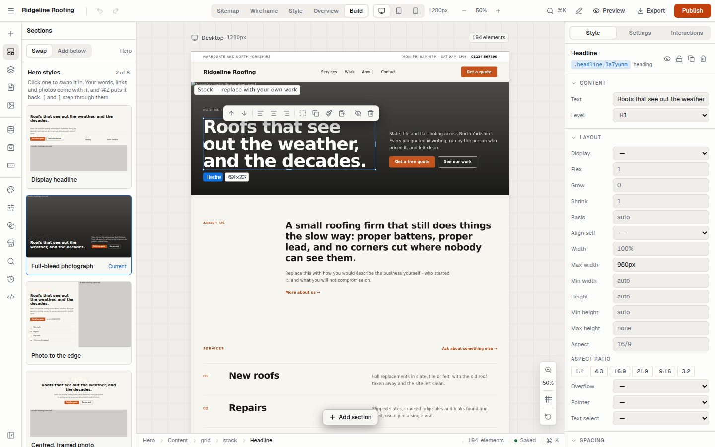
What it does
The parts of the editor that do the most work. Everything else, from versions to form submissions, is on the features page.
Sections drawn in your brand
Navigation, hero, services, work, process, areas, prices, questions, contact and footer, each in several styles. Every colour and typeface in them comes from the site’s brand, so a change to the brand reaches every page.
Swap a section in place
Click a section and the Sections panel lists every other style for that part of the page, in your brand and your words. Pick one and it takes the old one’s place.
A brief builder that follows rules
Describe the business in a sentence. The site is written from what you said, and the same brief always builds the same site. Anything you did not say stays a [bracketed] gap, never an invented claim.
Words edited where they are
Double-click a heading or paragraph and type. Bold, italic and links are on a small bar under the text, or ⌘B, ⌘I and ⌘K.
Your photos, header and footer
Upload photos once to the Media tab and place them anywhere, with alt text asked for every time. Set one header and footer and every page uses them.
Code you can take away
Publish from the Workshop, or export a zip of every page with one stylesheet, one script and a CLAUDE.md that lists what is still to replace.
Phones and tablets are worked out for you
Tablet and phone layouts come from the desktop design, by the same rules on the canvas and on the published site. Anything you set for a smaller screen wins.
- Desktop1280px
- The layout you design.
- Tablet768px
- Grids of three or more columns become two, and rows of three or more wrap.
- Phone375px
- Grids become one column, or two when every item is small, like a row of figures. Large type and padding scale down, and nothing runs past the edge of the screen.
From a first draft to a published site
- 01
Start from something
A trade template, a site built from your brief, or a site you already have, imported.
- 02
Make it yours
Set the brand once, then swap sections, type over the words and add your own photos.
- 03
Check every width
Look at each page at desktop, tablet and phone width, then preview the whole site.
- 04
Publish or export
Publish from the Workshop, or download the code with a CLAUDE.md and finish it in Claude Code.
The Workshop is part of the Lounge
It is a subscription in the Lounge, the workspace that comes with a Quooro account. The guide walks through each part in the order you will use it.